Multitenant Platform
new icon library
Creating a scalable icon system that supports scalable implementation across all applications. By harmonizing distinct visual metaphors with the Design System to establish a consistent navigation language for the cloud environment.
Designing a Custom SVG Icon Library for Enablon's new Platform Home
Enablon developed its new Multitenant Platform Home as a standalone starting page above applications, i.e., CoW, PHA, EHS, and Open Insights on the cloud server.
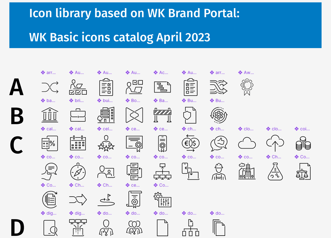
New Icon library created for Enablon applications
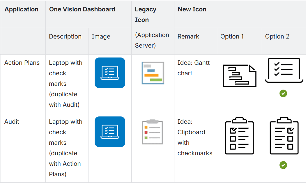
Comparison table during icon developments
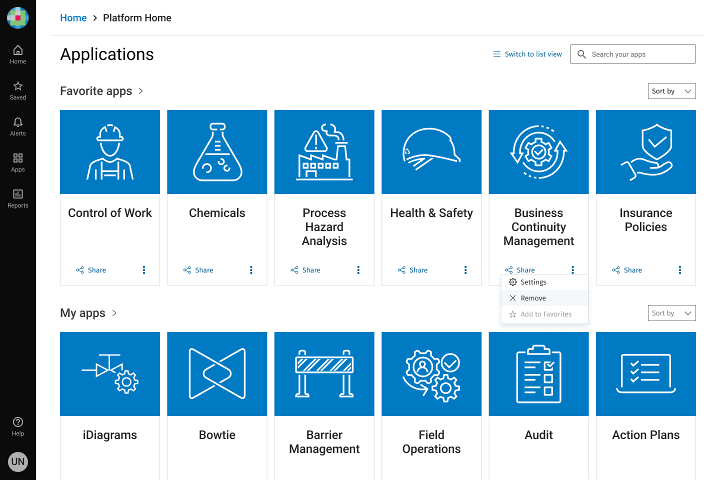
Implementations of new icons on home screen
Context
Enablon developed its new Platform Home as a unified starting platform for accessing multiple applications, including CoW, PHA, EHS, and Open Insights. However, the original implementation had usability issues that needed to be addressed.
Issues
The existing Platform Home had two critical UX issues:
Multiple applications shared the same icon, creating confusion and increasing the risk of users launching the wrong application.
Users needed more visually distinctive icons to quickly identify and access their applications, improving navigation efficiency and overall experience.
Design Goals
I set out to create a cohesive icon system that would serve multiple purposes:
Each application should have its unique, identifiable icon
Each application’s new icon on Platform Home is created in accordance with Wolters Kluwer icon style
Each icon needed to function as both a monochrome and a color version, maintaining clarity across three scalable sizes: basic, medium, and large.
For the Multitenant Home page specifically, we implemented the basic size icons to ensure optimal visual hierarchy.
Approach
Working closely with the design system team's front-end developers, I followed Wolters Kluwer's established icon design principles.
These principles emphasize simplicity and elegance while maintaining realistic representations. A key aspect of WK's branding identity is the use of open segments in icon outlines—creating gaps where lines overlap rather than intersections. This distinctive style gives the icons an open, approachable feeling while reinforcing brand consistency.
I tested the newly created and existing WK PDS icons within our UI layouts, drawing inspiration from current dashboards in existing CoW applications. The tile-based layout aligned with the card component standards in Wolters Kluwer Product Design System (WK PDS), ensuring consistency across the platform.
Solutions
I developed a custom icon library that seamlessly integrates with WK PDS's existing visual language and branding style.
The solution included creating unique, identifiable icons for each application while leveraging existing WK PDS icons where appropriate.
By incorporating the distinctive open-segment style, the new icons reinforce Wolters Kluwer's brand identity while remaining functional and accessible.
This dual approach ensured that every application had a distinctive visual identity while maintaining design system consistency, ultimately preventing user errors and improving application discovery.
Impact - section if you have metrics (e.g., reduced misclicks, improved task completion time)
Results & Impact
The new icon library successfully addressed the core usability challenges while establishing a scalable design system for future integration of applications from currently fragmented platforms.
The icon system's flexibility— the scalable SVG icons supporting both monochrome and color versions across three size variations—ensures visual consistency whether icons appear in the main Platform Home, dashboard tiles, or other UI contexts.

