New Workspace Navigation on Enablon Platform
Revived a high-value navigation pattern on a new platform architecture, reducing the interaction cost, streamlining the entry point, and significantly improving speed-to-task usability in direct response to customer feedback
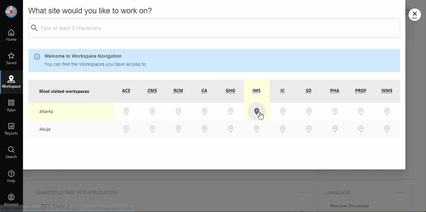
The key achievement was reducing the number of clicks in navigation from 6 to 2—dramatically improving efficiency for users who frequently accessed their Workspaces.
Navigating to Global Workspace - after
"I’m sometimes asked how I stay positive about Enablon because I see stories like this. It shows how our teams are capable of – not in the abstract but in a real, no-nonsense, true story of teams working together to deliver for our customers.”
Steve Kril
Customer Success Manager, Wolters Kluwer - Enablon
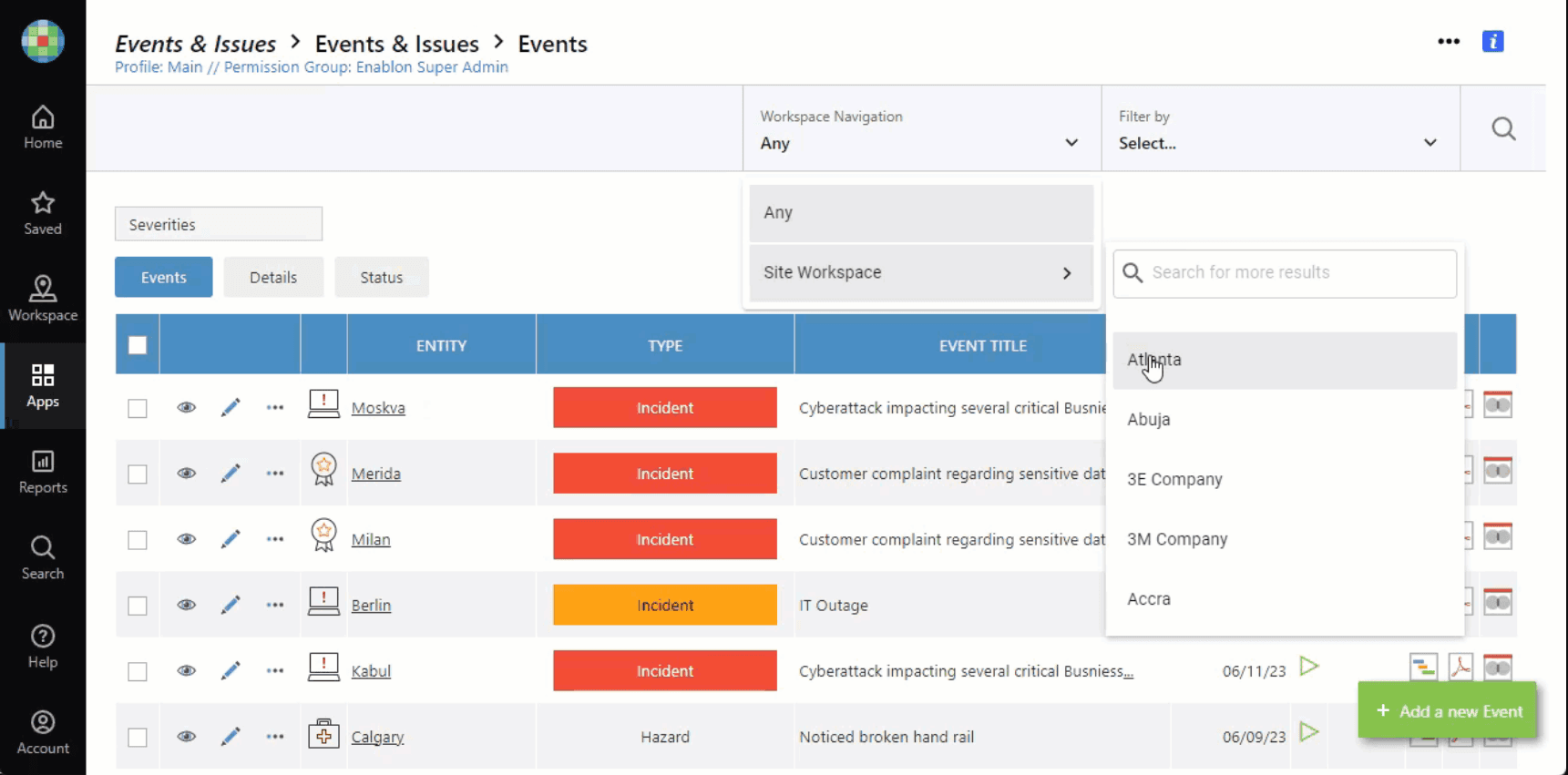
Before: it takes many steps to go to Global Worspace
Challenge
Longtime customers, like Merck, discovered during the platform upgrade that a critical regression had occurred: the Global Workspace Navigation feature they relied on daily had been removed.
While the engineering team believed these alternative navigation paths would guide users to their desired workspace, this created a significant usability issue: users who needed direct access to their Workspaces now faced a more cumbersome journey. Customer feedback through Product Board confirmed this wasn't an isolated complaint, and our cross-functional team was tasked with reviving this navigation pattern in a way that fit the modern interface.
Design Solution
Working closely with Product and Engineering teams, I redesigned the Global Workspace Navigation to provide direct access while modernizing the interaction pattern for the newest platform version. The key achievement was reducing the number of clicks in navigation from 6 to 2—dramatically improving efficiency for users who frequently accessed their Workspaces. I ensured the solution integrated seamlessly with the updated interface while maintaining consistency with our evolving design system. Beyond the interface work, I collaborated with the documentation team to create clear enablement guides that allowed customers to activate this feature immediately in the 2023 SP1 release.
Impact
The redesigned navigation was validated during a call with Merck, during which they enabled the feature in under 1 minute using our documentation.
Customers at Merck, such as Alex Dzomba, Associate Director Global H&S, praised the outcome and were left with the impression:
We listened to their needs
We want the user experience to be world-class
We revived an old feature in a new way
We delivered clear documentation that allowed them to immediately take advantage of our efforts
We showed them more value than they expected
This project demonstrated how thoughtful UX design combined with strong cross-functional collaboration can quickly address customer pain points while strengthening product-client relationships. The restored navigation not only solved an immediate usability problem but also reinforced customer confidence in our commitment to user-centered design.