Design system development
& management
Leveraging the Wolters Kluwer Product Design System, droved cross-platform consistency and accessibility. Aligned the platform with Wolters Kluwer’s branding strategy

As part of the Design System team, I established foundational components and patterns that enhance consistency, scalability, and design efficiency across our platform:
Information Architecture & Component Library: Mapped the platform-wide information architecture and built scalable building blocks with documentation.
Cross-Domain Standardization: Unify design language, establishing consistent color palettes, type scales, and icons that strengthened brand cohesion
Stakeholder Collaboration: Partnered with product managers, branding teams, and design system colleagues to align on standards and ensure seamless implementation
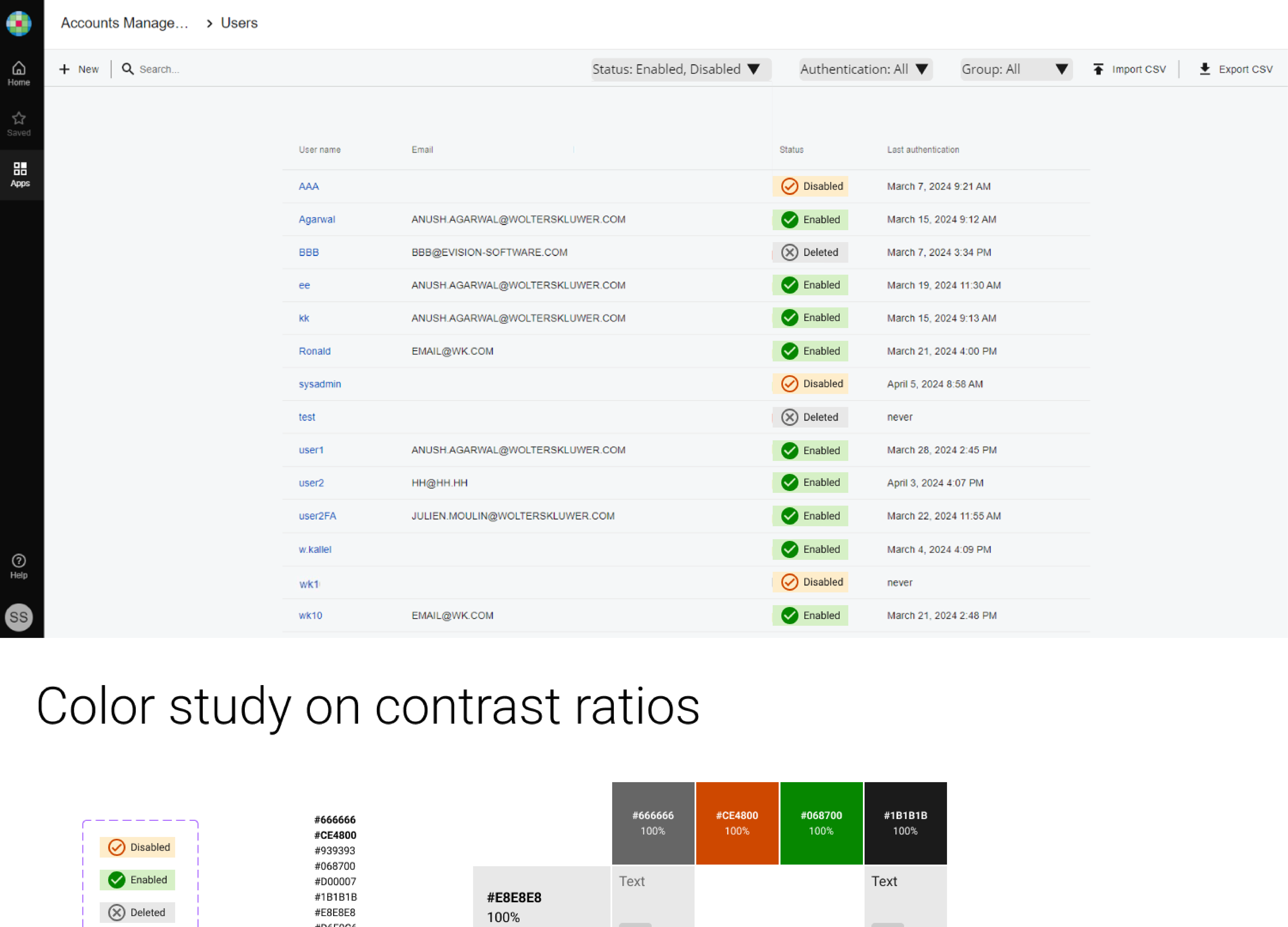
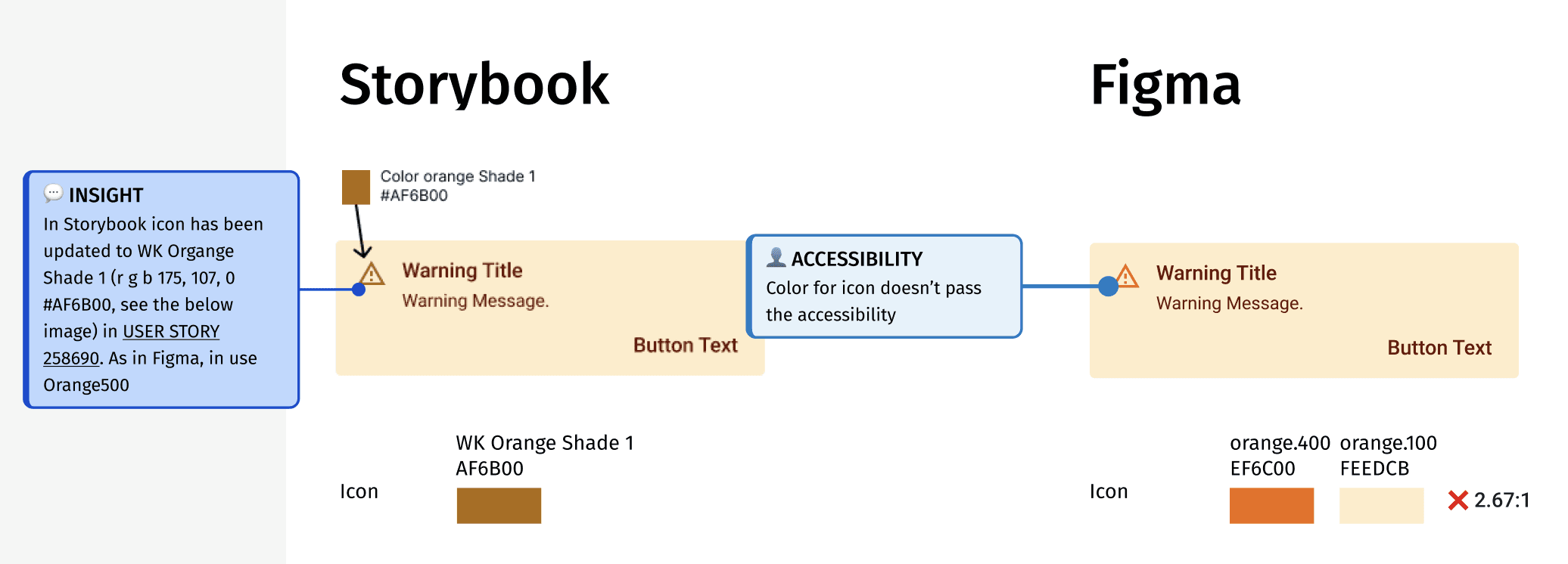
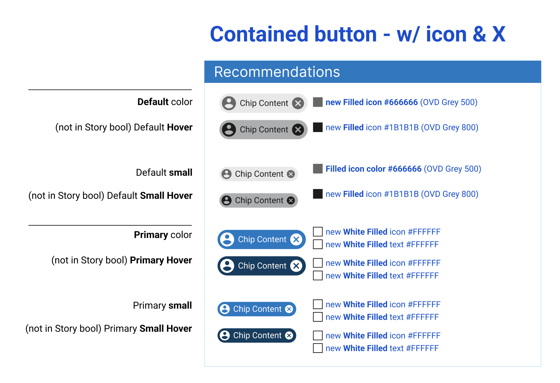
Accessibility Remediation: Updated non-conforming components to meet WCAG 2.2 success criteria
Tools: Figma, Zero Height, Storybook, Frontify
Focus: Design systems, WCAG 2.2 accessibility, corporate branding strategy, and component-based design

Enablon Global Navigation revamp project - wireframe

Enablon Global Navigation revamp - mapping ideas
Aligning pattern design with code development

Navigation design including asset content management
Next-gen navigation planning

Navigation flow planning

App drawer menu redesign, aligning with WK design system
Component design update for WCAG conformance
Challenges
Following Wolters Kluwer's acquisition of Enablon, the platform continued to operate with a legacy design system based on Material UI, which created significant friction for users.
One of the major initiatives related to design system management is revamping navigation. The legacy system has notable inconsistencies in navigation, such as:
illogical breadcrumb structures left users confused about their location in the system,
the absence of a universal search
navigate through lengthy sidebar menus.
Users frequently had to drill down multiple layers to reach simple destinations, and
moving between logically related applications required excessive effort.
These usability issues were addressed through global navigation UX revamping. Besides, the platform needed to transition from its independent Enablon identity to embody the unified Wolters Kluwer brand across all touchpoints.
My Contributions
Restructuring Information Architecture
I began by mapping the entire platform's information architecture to understand where the system was failing users and why. Working in Figma and the MIRO board, I translated these insights into redesigned components and patterns, leveraging the WK Product Design System, managing design tokens and variables to ensure scalability as the platform evolved.
Cross-Functional Collaboration
The transformation required tight coordination across multiple teams and tools:
Adhering to component and pattern guidelines documented at Zero Height, I managed a single source of truth that kept designers, developers, and product teams aligned as specifications evolved
Storybook partnership: Working directly with front-end developers who coded and stored components in Storybook, I was able to define the interaction behaviors and use cases, ensuring the implemented experience matched design intent
Stakeholder alignment: I collaborated with product managers across domains to establish consistency in color palettes, typography, and visual language, while partnering with the branding team to strategically deploy Wolters Kluwer's logos, icons, and brand elements throughout the platform
Brand Integration: I integrated Wolters Kluwer's branding guidelines throughout the platform, transforming Enablon from an acquired product with its own identity into a fully integrated part of the Wolters Kluwer family.
Accessibility: I audited existing components against WCAG 2.2 success criteria, remediating issues in color contrasts, typography, and button labels.
Impact
The transition to the WK Product Design System fundamentally improved how users interact with the platform while establishing Wolters Kluwer's brand presence:
Unified experience: we started the process to consolidate multiple legacy design systems into one cohesive visual and interaction language that reflects Wolters Kluwer's branding image and strategy
Accessible foundation: Created a WCAG 2.2-compliant component library with documented patterns that product teams can extend and conform to accessibility guidelines end-to-end
Reduced design debt: Eliminated years of accumulated inconsistencies by aligning all stakeholders on a single design system, streamlining design-to-development processes that scale with the platform's growth