Web Accessibility Design Leadership
My digital accessibility efforts for the Enablon product suite led to WCAG 2.2 Level AA conformance through systematic audits and cross-functional collaboration
Over the past two years, I led digital accessibility efforts for the Enablon product suite, achieving WCAG 2.2 Level AA conformance through systematic audits, cross-functional collaboration, and targeted remediation that resolved 90% of identified issues. This work established organizational accessibility capabilities that proved crucial in securing a significant contract with Microsoft, demonstrating the strategic business value of accessibility excellence.
Successfully resolved 90% of identified accessibility issues within 2 years, demonstrating measurable progress toward full WCAG conformance that helped Enablon secure contract with Microsoft.
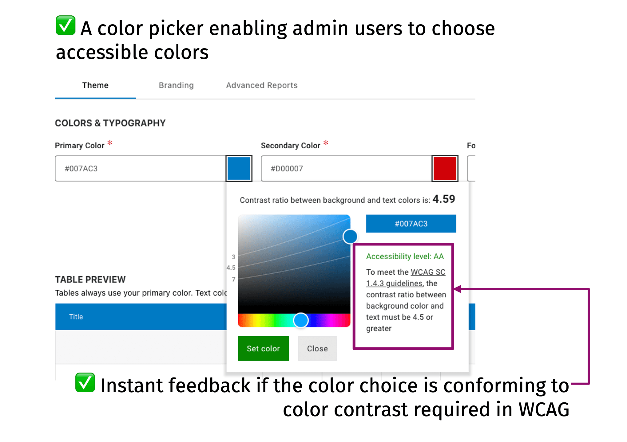
Color picker redesign with contrast ratio detectionion
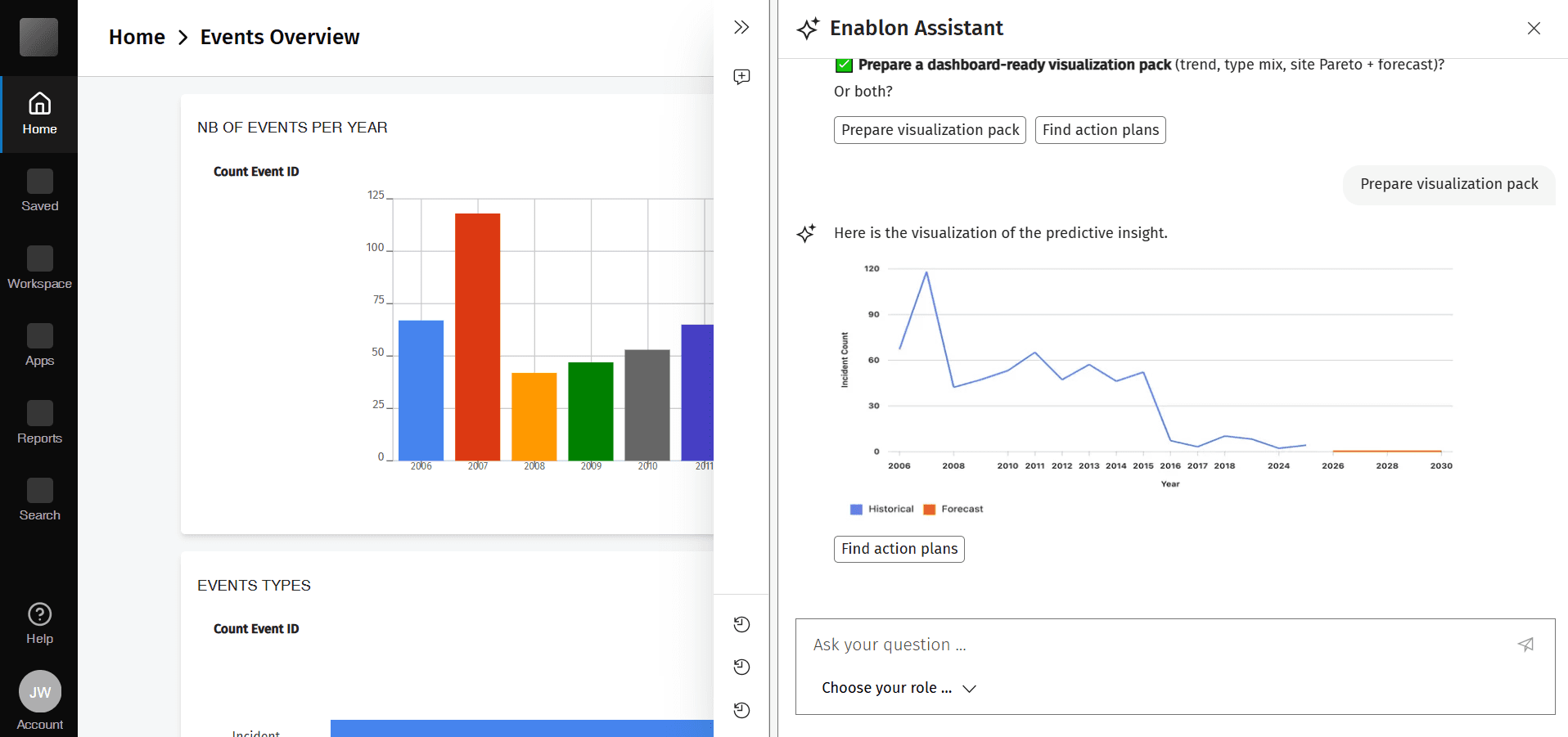
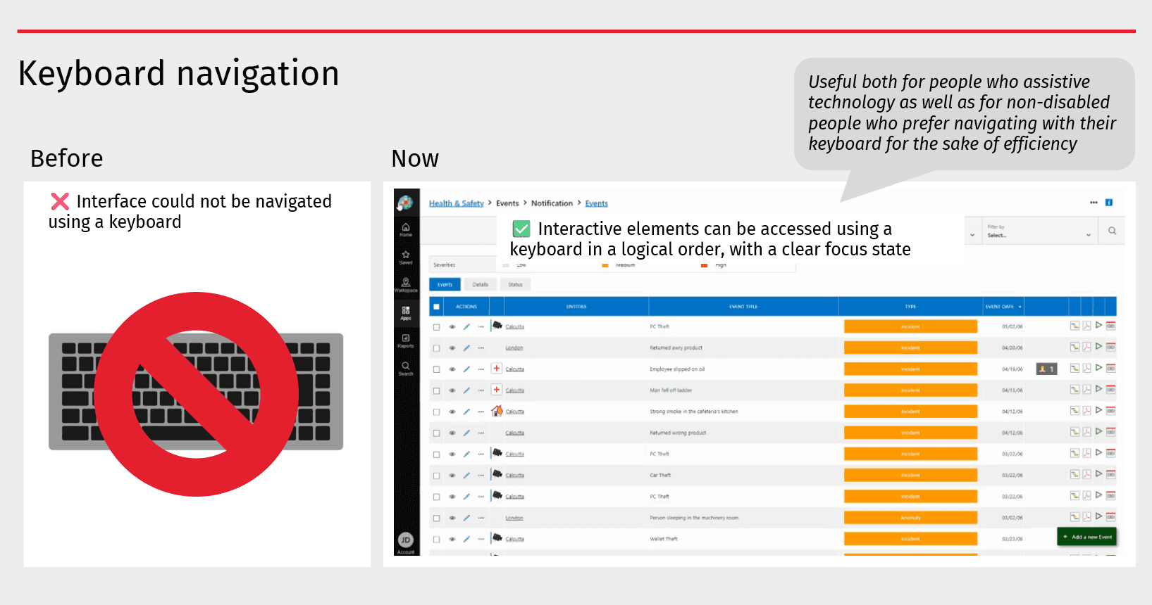
Assistive technology for keyboard navigation
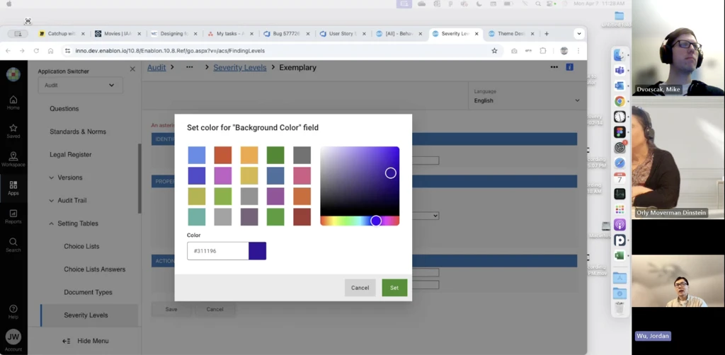
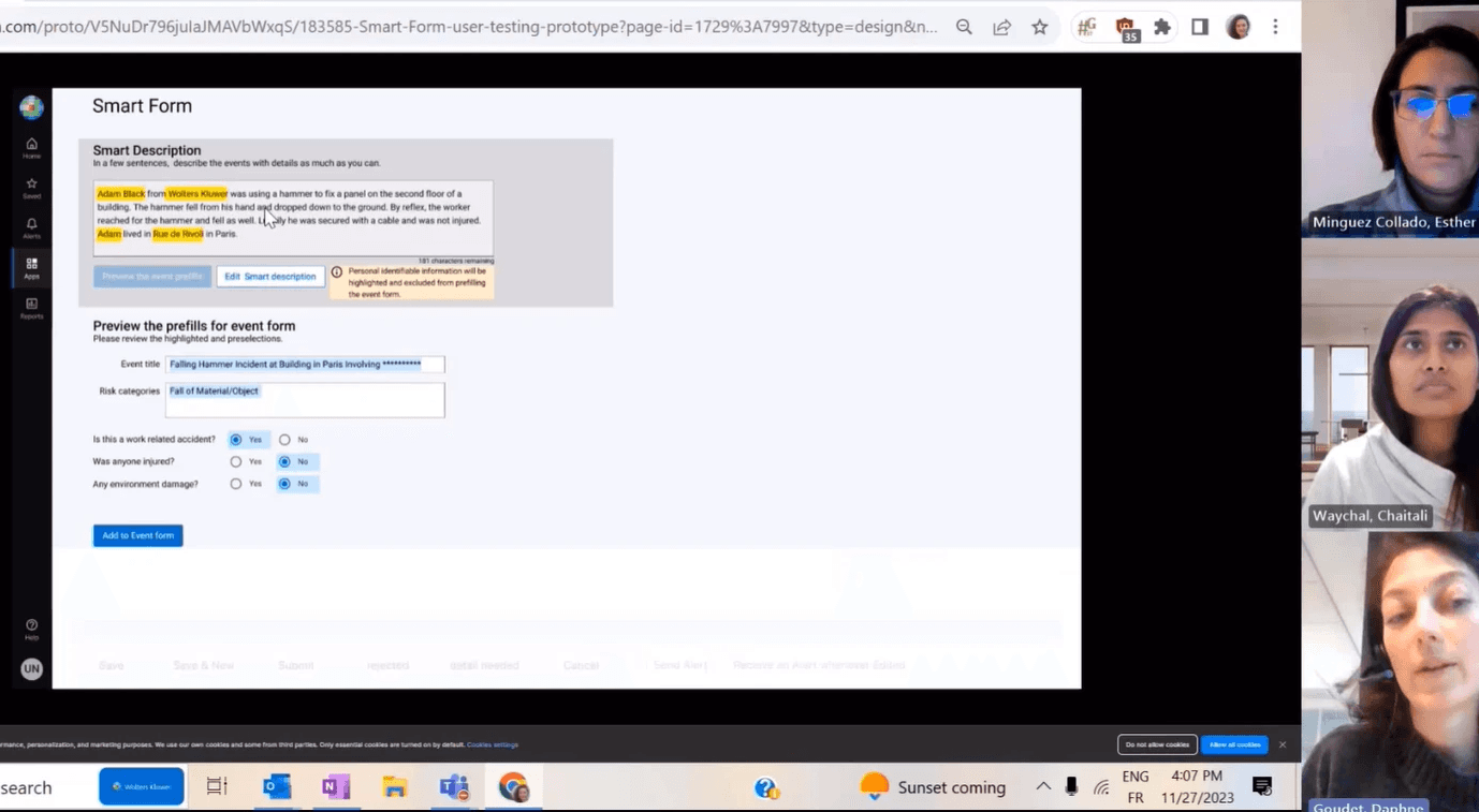
Color picker user testing
Comprehensive Accessibility Auditing & Remediation
I led accessibility audits across Enablon products, conducting thorough evaluations against WCAG 2.2 success criteria to identify and document barriers to access. I identified critical issues spanning:
visual design,
keyboard navigation,
responsive behavior, and
assistive technology compatibility.
Working closely with product teams, I researched and implemented optimized solutions that balanced accessibility requirements with existing design systems and technical constraints. My approach emphasized not just compliance but creating inclusive user experiences that enhanced usability.
Visual Accessibility & Responsive Design
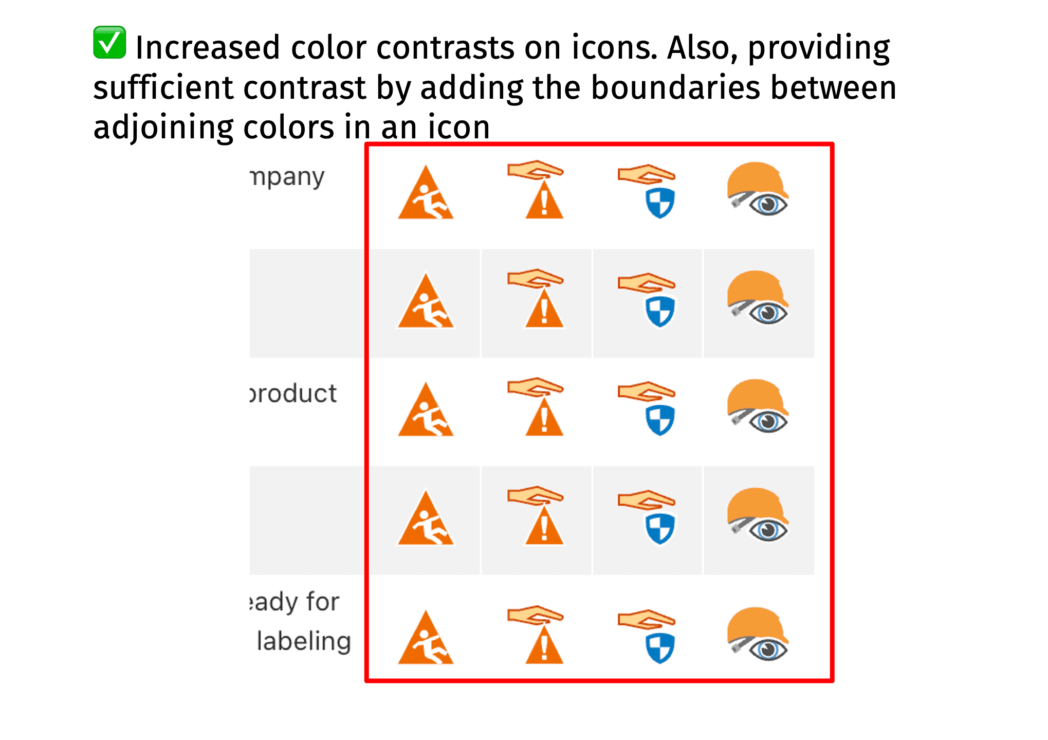
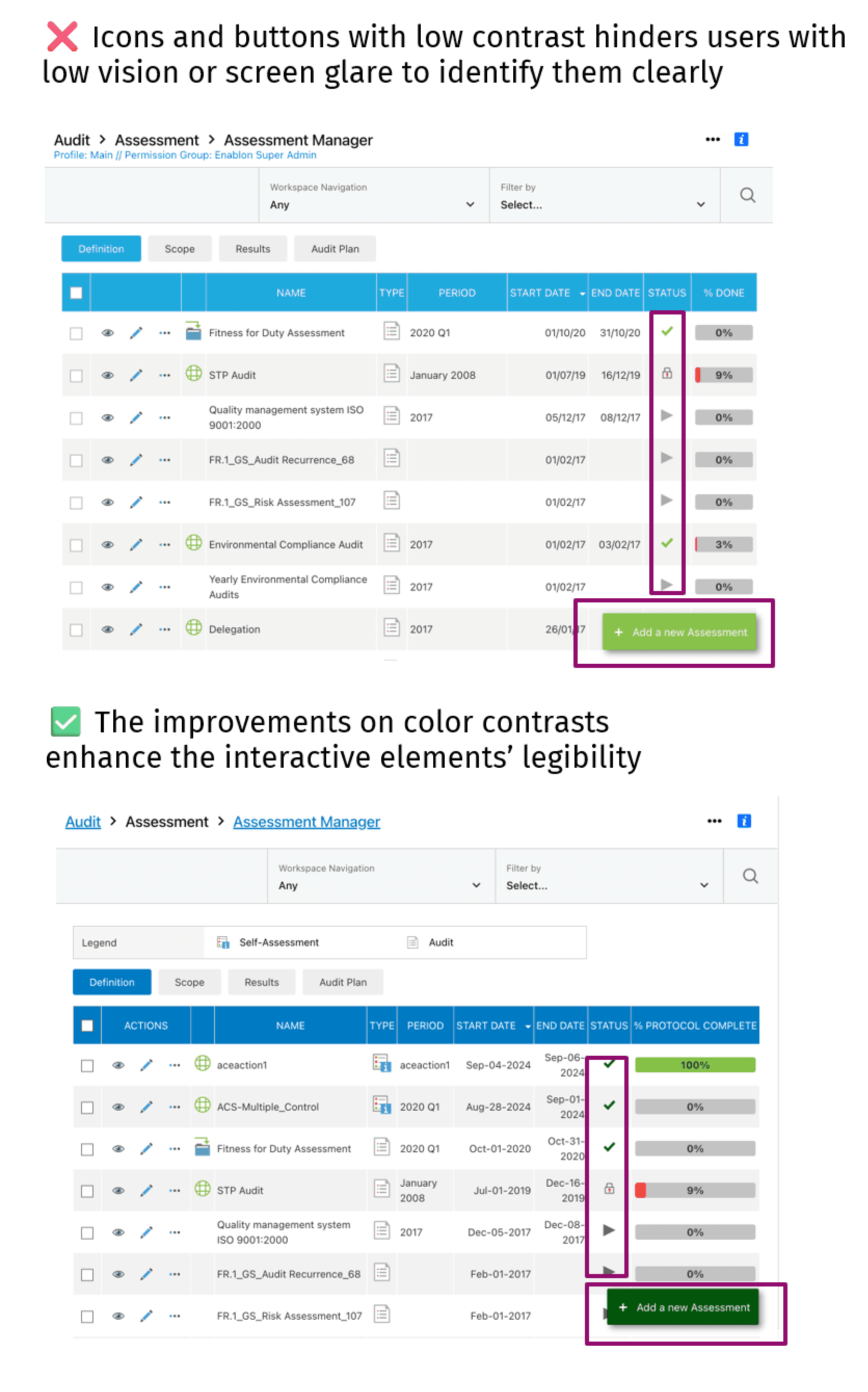
A significant focus of my work addressed foundational visual accessibility principles, including
color contrast ratios to meet WCAG AA standards. I redesigned interface elements to ensure perceivability for users with low vision and color vision deficiencies.
screen orientation flexibility and responsive design patterns that maintained functionality and readability across device sizes and orientations, ensuring content reflow at 400% zoom levels.
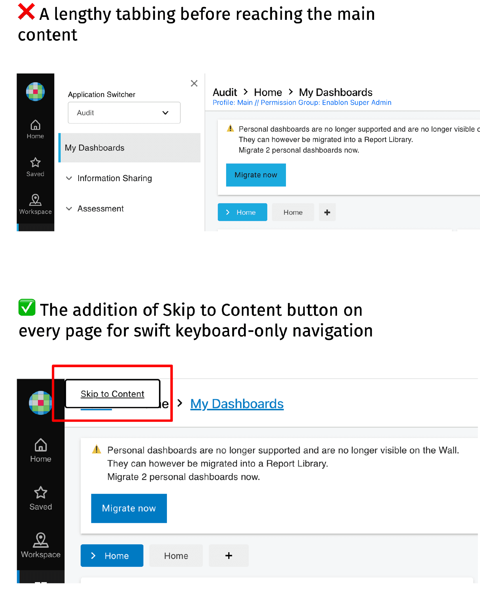
Assistive Technology Optimization
To ensure compatibility with screen readers and other assistive technologies, I implemented robust semantic HTML structures and ARIA (Accessible Rich Internet Applications) markup. This included
adding meaningful tooltips, aria-label, or aria-labelledby attributes to provide context for interactive elements,
restructuring page landmark regions (main, navigation, complementary) to create logical content hierarchies, and
optimizing focus management and tab order to enable efficient keyboard navigation.
These improvements created predictable, navigable experiences for users relying on assistive technologies, ensuring that all interactive elements were discoverable and operable without a mouse.
Through this work, I have developed a comprehensive understanding of inclusive design principles, accessibility testing methodologies, and the implementation strategies necessary to embed accessibility into the product development lifecycle.
Organizational Impact & Accessibility Maturity
Beyond individual product improvements, I played a key role in establishing an accessibility maturity model for the organization. This framework provided a structured approach to assess our current accessibility capabilities, identify gaps, and define a roadmap for continuous improvement across design, development, and quality assurance processes. I also created a quick accessibility solution finder to help guide our internal stakeholders in finding solutions for the accessibility issues we encounter most frequently in our product design and development.
By establishing clear maturity levels and success metrics, I helped embed accessibility as a core organizational competency rather than a one-time compliance effort. The cumulative impact of these initiatives—achieving 90% issue remediation and building sustainable accessibility practices—directly contributed to Enablon securing a major contract with Microsoft, demonstrating how accessibility excellence creates tangible business value and competitive advantage in enterprise markets.
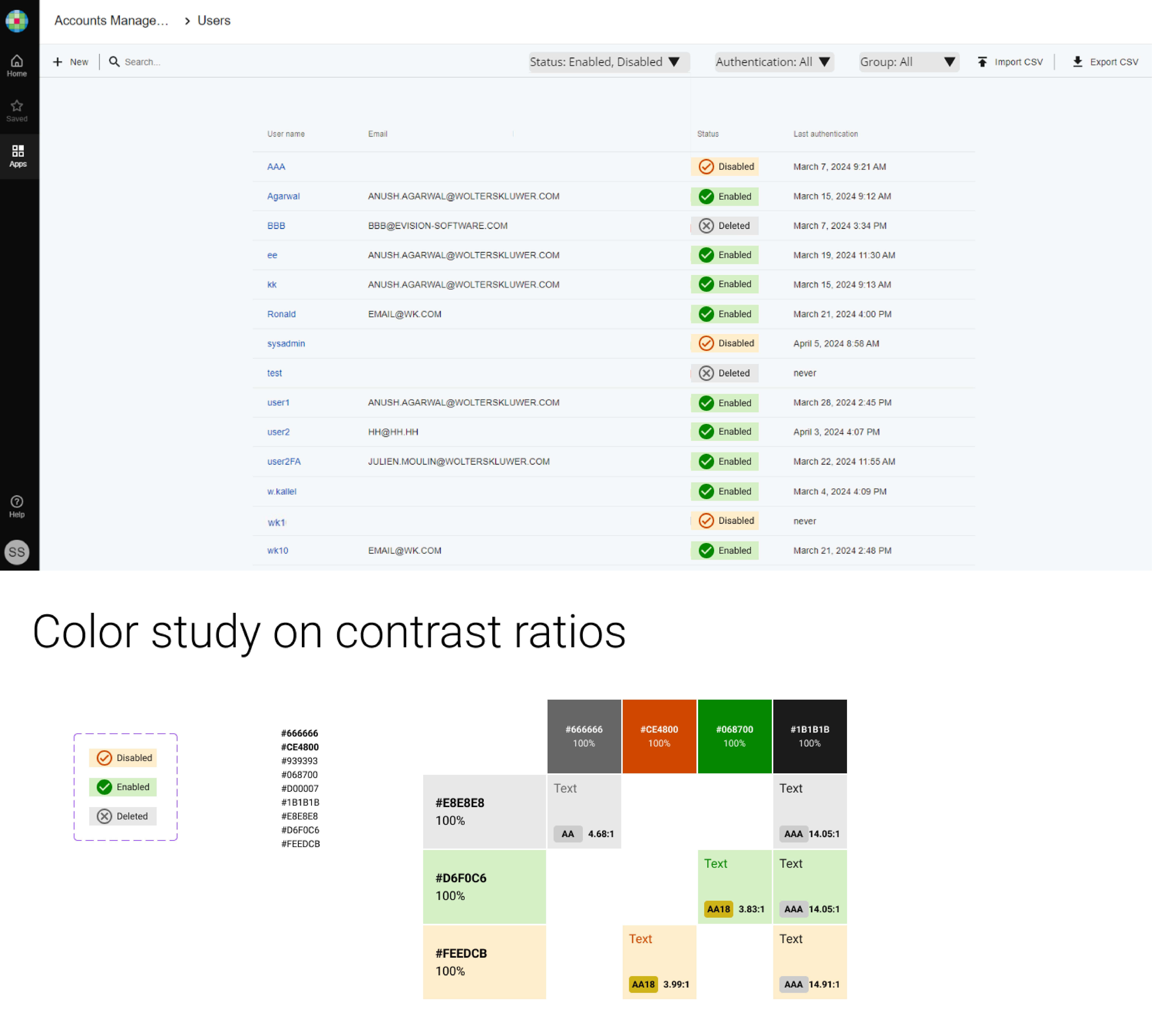
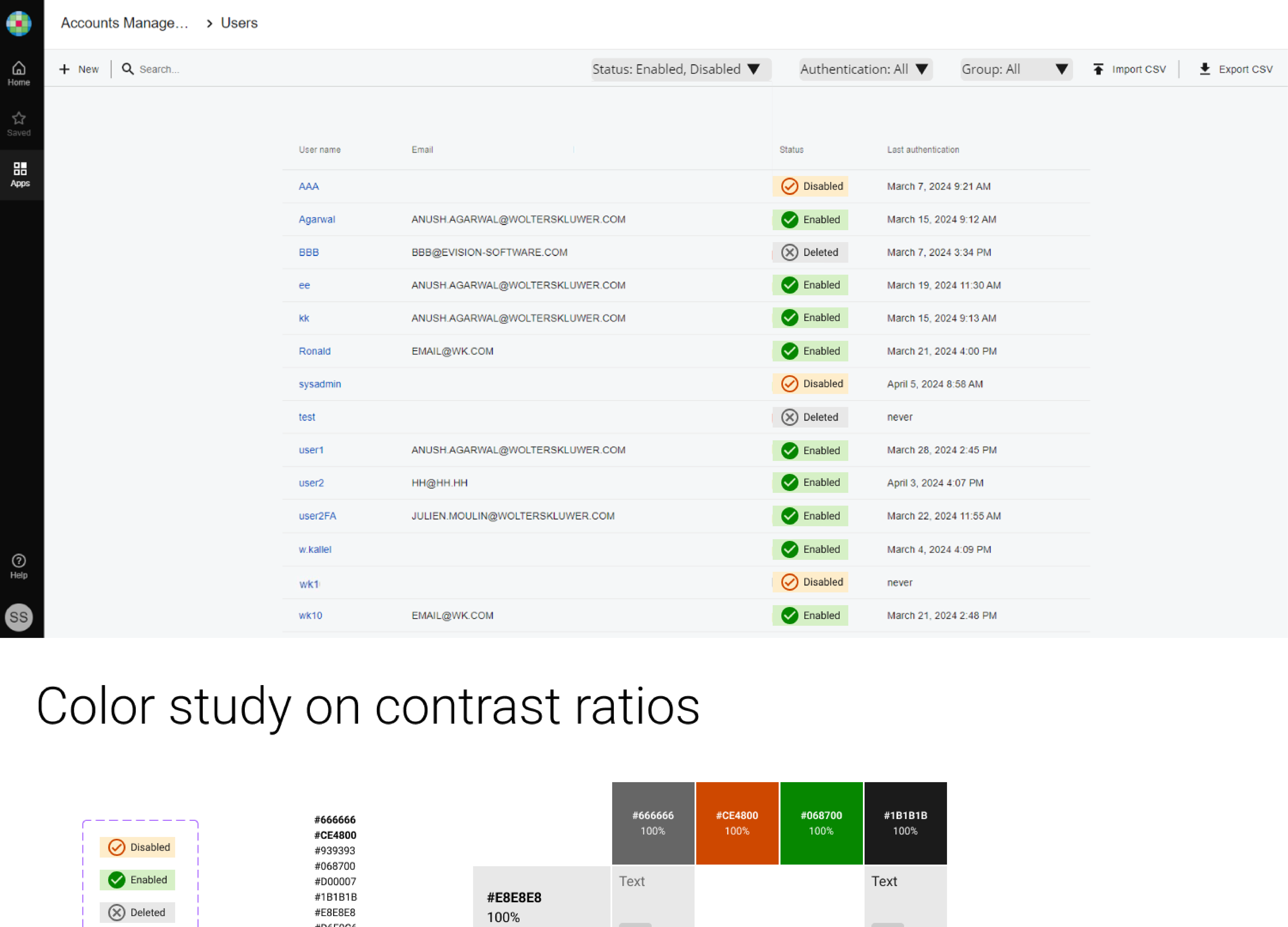
New accessible design for the user list
Checked color contrast ratios
Use accessible colors for icons and labels of Disable, Enabled and Deleted statuses against colored bands - conforming to WCAG SC 1.4.11 “Required for understanding”, and SC 1.1.1 “Non-text content, pure decoration”
Pro - The label’s rectangle color band is a break from the look of button with 4 rounded corners
Pro - use the combination of color-coded icons and labels as 2 differentiators to distinguish between every 2 statuses