Responsive Design for
Enablon SaaS
Scaled the platform from desktop-only to a company-wide responsive design strategy. The mobile-first platform design empowers field operators with a seamless on-site experience

Role:
UX Designer & Accessibility Lead
Tools:
Figma, Miro, Storybook, and Product Board
Process:
Research & usability audit
Information Architecture
Prototyping & Design on mobile-first responsive redesigns
Documentation: Creating enablement guides
Challenge
Enablon’s SaaS applications were built originally for EHS managers and administrators working on desktop computers. As the user base expanded to include field operators, the platform required a comprehensive responsive overhaul to support mobile workflows and diverse on-site conditions.
Objectives
Universal Adaptation: Deliver a seamless experience across mobile, tablet, and desktop.
Inclusivity: Enhance accessibility for all user types.
Optimal Performance: Ensure ease of use in varied field environments.
Approach
User-Centered Experience
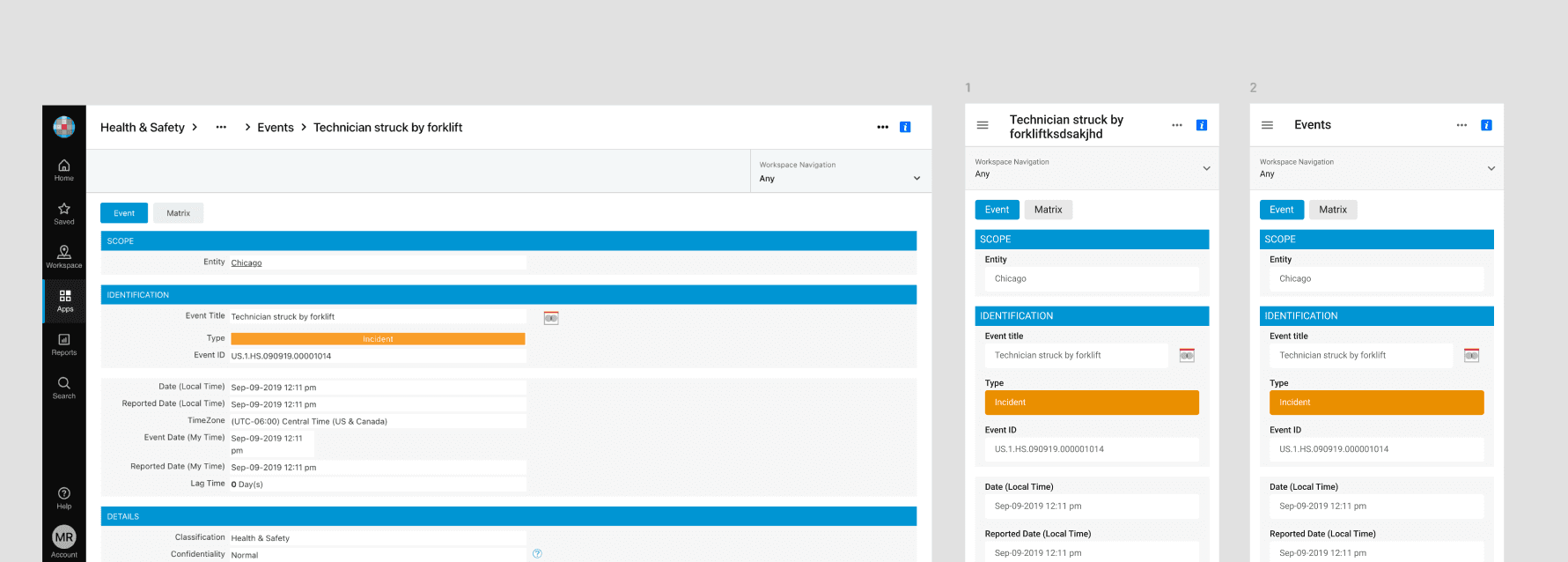
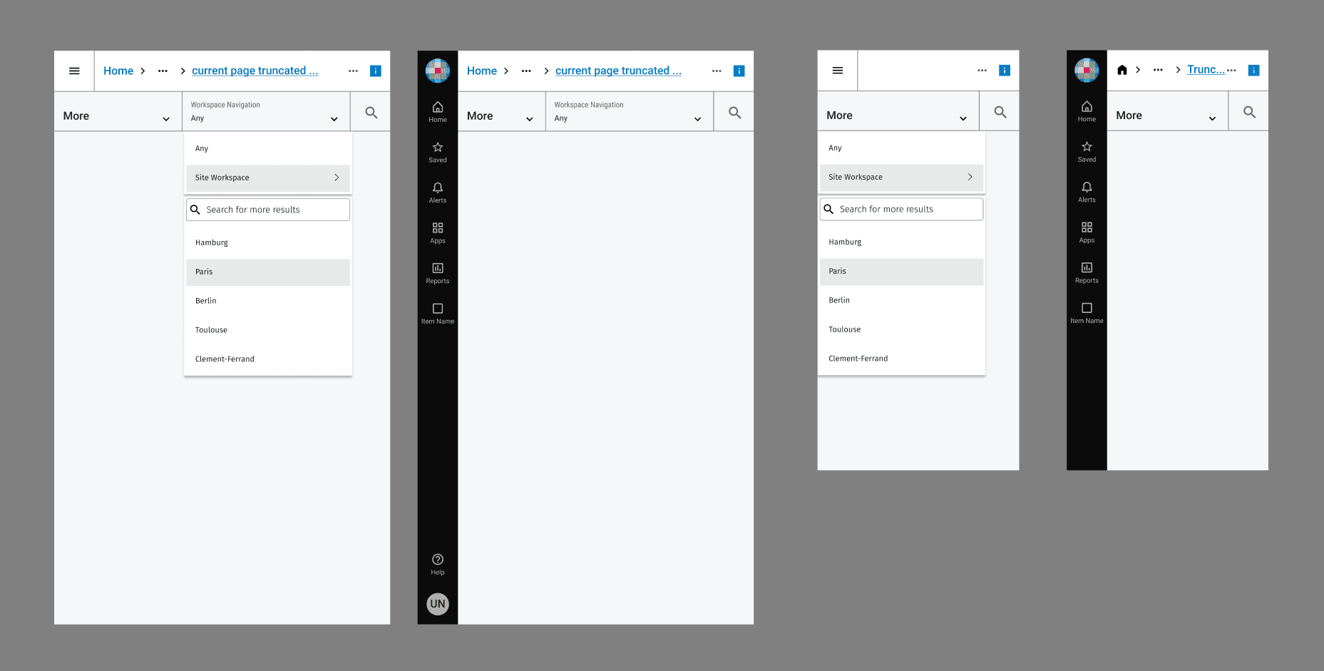
Applying semantic HTML page layouts
Prioritized clarity and ease of use for field operators working in varied conditions.
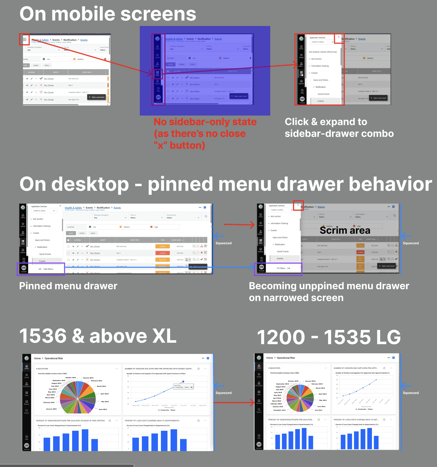
Fluid Layouts & Reflow
Redesigned page structures with automatically reflow.
Meet WCAG 2.2 Success Criterion 1.4.10 (Reflow)
Eliminating horizontal scrolling
Supporting zoom levels up to 400%.
Strategic Technical Execution
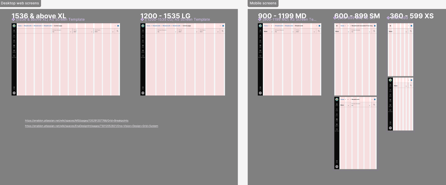
Breakpoint Strategy: define specific layout thresholds across the device spectrum.
Preserved Control: Integrated accessibility best practices that allows zooming without breaking interface.

Impact
Expanded Reach: Successfully expanded Enablon's reach to a larger, mobile-dependent workforce.
Strategic Foundation: Established the mobile-first design template for new product releases.

