Multitenant Platform
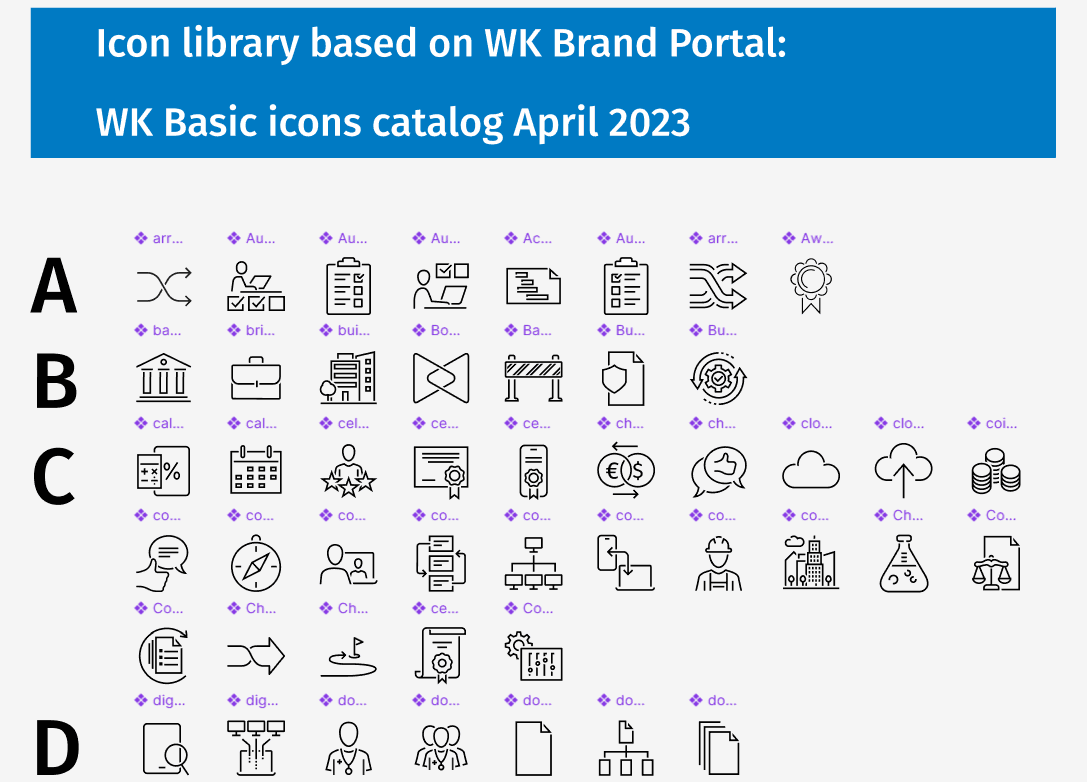
new icon library
Establishing a scalable and consistent icon system for the cloud environment by harmonizing distinct visual metaphors with the Design System,
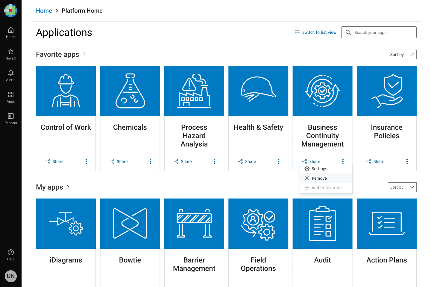
Designing a Custom SVG Icon Library for Enablon's new Multitenant Platform Home - a unified entry point for core applications, i.e., CoW, PHA, EHS, and Open Insights on the cloud server.
Context
The Platform Home was built as a central hub for accessing disparate cloud applications, but the initial launch lacked the visual clarity and usability needed for a professional enterprise gateway.
Issues
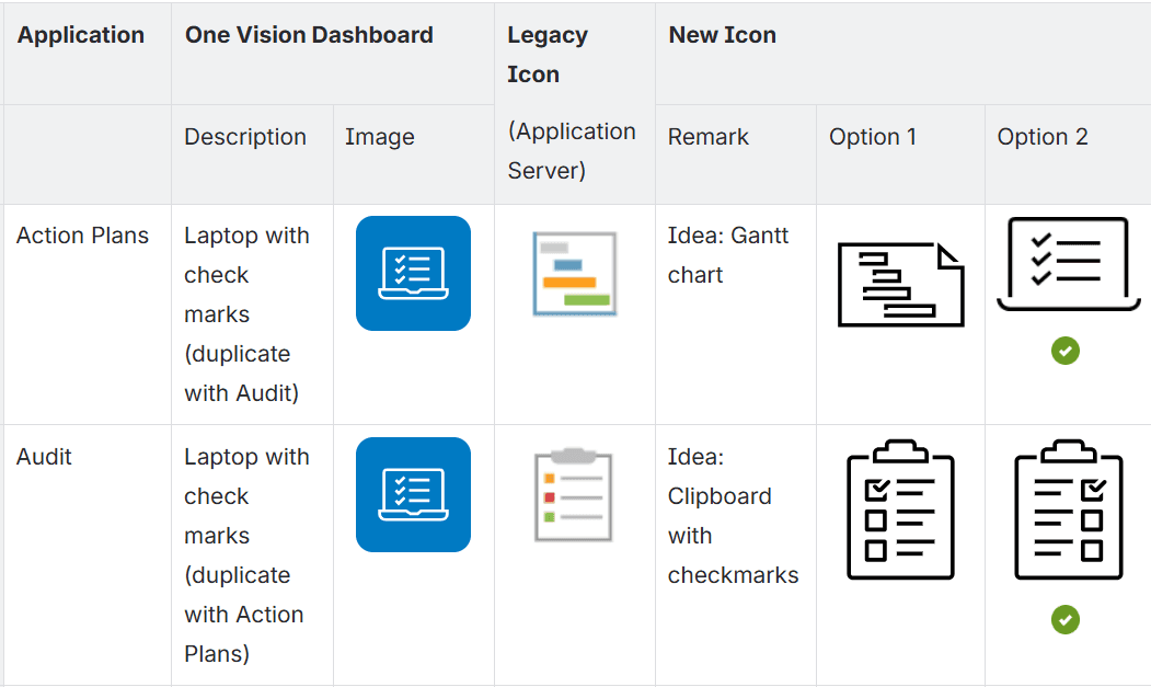
Visual Ambiguity: Multiple applications shared the same icon, leading to confusion and accidental launches of the wrong application.
Poor Discoverability: A lack of distinctive markers slowed down navigation and increased cognitive load for users.
Design Goals
Unique Identities: Ensure every application has a one-of-a-kind, recognizable icon.
Style Alignment: Adhere strictly to the Wolters Kluwer (WK) icon style for brand cohesion.
Functional Versatility: Design monochrome and color versions across three scalable sizes (Basic, Medium, Large).
Optimized Hierarchy: Implement specific "Basic" sizing for the Home page to maintain a clean visual layout.
Approach
I worked alongside frontend developers to master the WK branding signature style: open segments. This style uses deliberate gaps in overlapping lines to create an open, approachable, and simplistic feel on the icons. Then I validated the library by:
Testing icons within tile-based UI layouts inspired by current CoW dashboards.
Ensuring every asset aligned with the WK Product Design System (WK PDS) card component standards.
Solutions
I developed a hybrid library of custom and existing WK icons that eliminated the "duplicate icon" problem.
Brand-Consistent Assets: Leveraged the signature "open segment" style to reinforce branding and visual language in new icons while remaining functional and accessible.
Error Prevention: Distinctive visual markers improved application discovery and significantly reduced user error.
Dual-State Utility: Every icon was optimized for both light/dark modes and various interactive states.
Results & Impact
The icon system transformed a confusing entry point into a high-performance gateway.
Future-Proofed: The SVG framework is ready to scale as more fragmented platforms are integrated.
Universal Consistency and Scalability: Icons maintain pixel-perfect clarity whether displayed in small dashboard tiles or large hero elements. Icons are in both monochrome and color versions.
Operational Efficiency: Reduced the "time-to-launch" for users by providing a predictable, professional navigation experience.

